- cross-posted to:
- liftoff@lemmy.world
- cross-posted to:
- liftoff@lemmy.world
Lots of great changes have been added by our growing team of contributors as highlighted below. If you want to join the team come and say hello at the team discussion on Matrix
Please note that many lemmy servers are under massive pressure today, so you may see many unexpected error messages and silent failures. Please bear with us all!
Updates should appear on TestFlight and Play Store today.
v0.10.5 Release
iOS:
- TestFlight (will be visible later today)
Android:
- GitHub
- Play Store
- If you want to stay up to date with the latest releases before it gets on Play Store or F-Droid, checkout Obtainium
Hello everyone! We are blown away by the tremendous support from the community! Thanks for using our app and helping beta test as we round things out.
It’s been a few days since we’ve posted an update and the team has been hard at work with a TON of bug fixes and some new features.
Change log
- Added configuration option to automatically convert .webp images to .png for saving (njshockey)
- Added error messages and retry buttons for instance loading errors (zachatrocity)
- Implemented comment contexts and added “Show context” and “View all comments” buttons (jcgurango)
- Fixed several issues with comments not loading correctly after posting a new comment (jcgurango)
- Fixed and updated ModLog Pages & API (zachatrocity)
- Added menu item to view a community in a specific instance other than the originating instance (jcgurango)
- Added shadow to bottom tab bar to visually offset it from cards underneath (swmarks)
- Added Chrome Custom Tabs / Safari View Controller to replace in app browser on Android & iOS (swmarks)
- Added deep link support for links like liftoff://lemmy.world/c/liftoff (shocklateboy92)
- Updated l10n translation hooks, and added strings (mykdavies, zachatrocity)
- Changed “You’re not logged in, log in” message to dismiss after 7 seconds (christopher-conley)
- Fixed an issue causing login to fail if there is a space after the username (christopher-conley)
- Changed photo previews in post feed to have a consistent maximum height and updated opening animation (prefanatic)
What’s coming
- We hear you about notification badges. Those are coming, PR is opened and being tested. As well as local pushed notifications via scheduling
- Ultra compact view. Really we will be adding a 3rd view type so we will have card, list, and compact. The current compact view will become list
- Even more error handling for instance failures.
- bugs bugs bugs
HI, the photo preview height is a bit too low, it cuts basically any meme and force you to click on them each time, can you add an height control or a disabile option in future version?
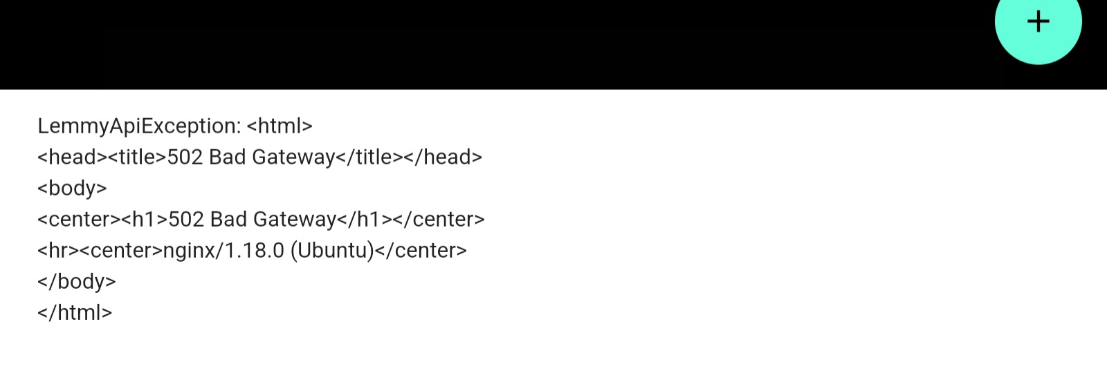
Also, any way to hide this? I know is a server issue, but can we disable it from showing?

We’re gonna shrink it down into a more concise error message for 502s but we’re not gonna stop displaying it
Perfect! I like the fact that you’re showing the error, so I can know exactly what went wrong, whether it’s likely on my side or the server’s.
That’s great 👍
Hi! Can you make the post preview height toggle able? I preferred it the old way and now I have to click the images in order to see my memes fully… That’s rather
inconvenientannoying. Edit: changed inconvenient to annoying as it is really annoying to have to click every image.Yeah we’ll add this to a toggle in the settings
Yeah, I don’t like this new layout as much. Greatly prefer the old way
We’ll make this toggleable. Thanks for the feedback
Came here to post exactly this, it would be much better if it was a toggleable option for the fixed card height, I liked just scrolling and in fact was the reason I switched to liftoff, was just a better experience, now it’s annoying.
Agreed I’d rather see an entirely too long post occasionally than have to click/tap every other one just to see the punchline to a meme I already read half of while scrolling
Changed photo previews in post feed to have a consistent maximum height and updated opening animation (prefanatic)
Thanks, I hate it. I don’t want a preview, I want the real thing. Full pictures in the feed was one of my favorite features about Liftoff and you just removed it completely. Could at least have made it a setting.
I guess I could live with previews if there was a clear indicator on whether I’m seeing a preview or the whole picture fits the maximum height - now I only realize I need to click on it because e.g. the meme doesn’t make any sense so there’s probably some caption that I’m missing.
Great work otherwise, thank you for your efforts, but this feature sucks. (Great opening animation, though.)
I hate to be a bother, but I support this comment. I was quite happy just scrolling my memes without needing to tap on the post, but now top text and bottom text are cut off most of the time.
Great work. Can I ask again please for allowing to change the font size of comments?
My eyes are not that great anymore and the current comments are at the edge of readability for me.
Really impressed by the speed with which these updates are flying out. Great work!
I hate having to push this every time but is there any progress on being able to see media and images in a post while commenting, without having to exit the comment altogether?
I seem to have lost full height images in my feed. Was one of the reasons I ended up sticking with liftoff.
This has been added back!
Connect for Lemmy dev here. That photo opening animation looks great!
Wow lots of stability improvements for sure! Looking forward to those next updates!
The new in-app-browser is truely an improvement, thank you!
This was my main qualm. Love it.
not sure if this is a feature or not but whenever you collapse threads and then scroll to the top of the post without pulling to refresh ( to confirm info OP says to comment on, etc), the app acts like it is entering a new post and un-collapses all threads when you scroll back down… almost like the app refreshes and doesn’t save preferences until you get out of the post
to add to this, it only seems to happen when a post has enough comments to actually scroll, like this post. other posts with non scrolling amount of comments don’t seem to be affected
Same, I just started using Liftoff and got a little lost because my comments expanded again once off screen.
It’d also be nice if they removed/shrunk the “tap to expand” line, or made it inline with the commenter username, sort of like collapsing on the official Reddit app.
I love this app so damn much. Thank you for continuing to persevere <3
Is there a way to see why the Play Store release is being marked as incompatible with my device? Because the GitHub version runs perfectly fine.
Device in question is an OnePlus 3 running LineageOS 18.1 (Android 11)
Wow and I thought my 8T was running really well for being almost three years old. Yours is seven!
I changed out the battery but other than that it’s still going strong. More than powerful enough for my workloads (mainly browsing and videos).The OLED screen is still in perfect condition.
Doesn’t support 5G and some GNSS providers if that’s something you care about. But at some point I’ll be forced to upgrade because its not going to get anything newer than Android 11.
You guys are legends, I love this app. Thanks for all of your work.
Would it be possible to deselect instances in settings, so they don’t appear anywhere in the app until I reenable them in settings?


