Please remove this if already reported.
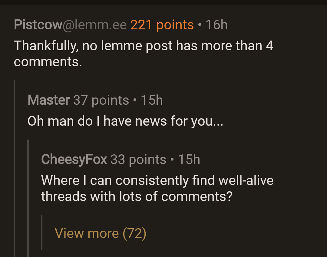
Thankfully, no lemme post has more than 4 comments.
Oh man do I have news for you…
Where I can consistently find well-alive threads with lots of comments?
Here, if we’re lucky
Has anyone really been far even as decided to use even go want to do look more like?
¡¿Que?!
Creo que ha tenido un derrame.
Maybe a little one lol
Do you like Star Trek? There are a lot of very active Star Trek communities.
I do not :(
You have every reason to be sad
I like the Orville, despite it’s clunkyness.
It probably depends on your instance, but if I go to everything and sort by active, there are a bunch of posts at the top with hundreds of comments. On Lemmy it’s way more normal to comment on a post that’s a couple days old than it has been on Reddit for almost a decade.
 Lmfao
LmfaoMostly politics with the constant back and forth.
Yeah, I dunno how new this guy is, but…
Let’s try you do that just for fun
Craziest thing I’ve read all day… Inside a post with 106 comments at that lol. Don’t know where you’ve been or what kinds of posts you been looking at haha
I actually loved when I saw this a week ago. It went far enough that only a single letter was on each line.

Netflix.
Ta Dunnnn
Was it the piped link bot loop? I saw it too.
Sadly no lol. I missed that whole thing. It was two people have a long ass argument that kept going on and on.
Do you have a link to that? sounds amazing
I got it in this tread.
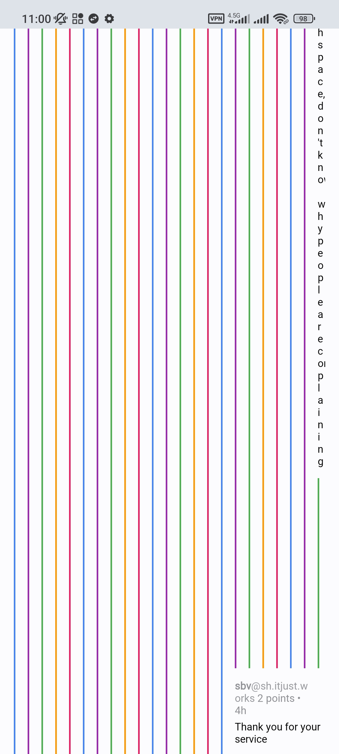
I definitely love the look. Feels like an award for going too deep.
Huh. I thought this got fixed in Sync for Reddit.
I remember there being a button to continue a thread on a new screen when it got too deep.
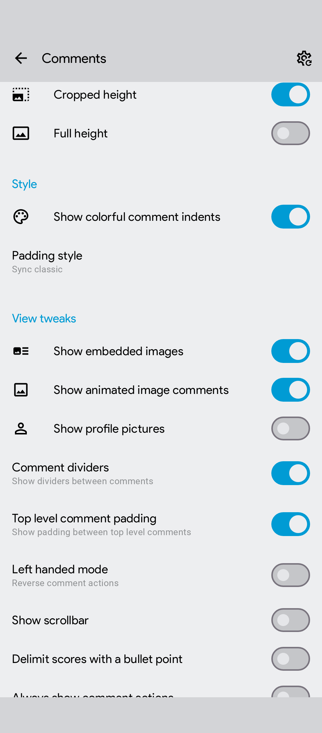
Yeah… This is a settings issue because I don’t have this problem at all.
Unfortunately, I don’t know which setting off the top of my head is responsible for it though.
My guess would be either padding style, comment padding, or something else in that area… Comment dividers maybe
Apollo did that as well!
I still miss Apollo :(
That’s a feature. Statistically, comment quality is inversely proportional to it’s depth.
Don’t go deep diving!
(And this is /s if anyone’s wondering.)
It’s beautiful
The tumblr special
You guys have colours?
Can be changed here: Settings shortcut: Comments > Show colorful comment indents
That link is magical
Yeah I’m definitely (even) more impressed by that link than by my now very colourful Sync interface. All apps should have that kind of link feature.
(FYI: Long press any settings button to copy a direct link)
Since you’re smart: how can I make tapping a comment collapse the comment itself, not only its children
Oh my God, you’re my hero
Is there also a way to alter the swipe actions on comments and posts?
The default are “upvote” “save” and “reply”, but by definition you barely ever want to save, and the most used action (downvoting) is absent
Yes, I have it set to upvote, dv, and share
Can be changed here:
Settings shortcut: Comment options > Swipe comments for additional options
Thanks man
I just noticed that you also mentioned swipe actions for posts in your comment, what I linked is only for comments, for posts you go here:
Settings shortcut: Post options > Extended swipe posts for additional options
P.S. - for anyone who wants to copy a direct link to settings but isn’t aware (like I wasn’t before this post) you just open the relevant setting and press and hold the setting you want to copy the link to and paste it in the comments.
Thank you, kind stranger.
You have dug too deep!
Watch out for Balrogs!
Oh man, this reminds me of the early days on reddit
Isn’t that how their app still is?
I thought there was an update that stopped this from happening, but early on there were so many threads about this. I’ve since moved to ios so I haven’t used sync in a long time, just enjoy following certain developers
Cool. I really didn’t know if that was still a thing or not.
Removed by mod
That comment chain is D E E P
I’m curious what post this is from lol
Unsurprisingly from a politics thread: https://lemmy.world/comment/3761680
That’s just the way life is sometimes.
Yea I’ve had this issue pop up several times, not ideal aha


