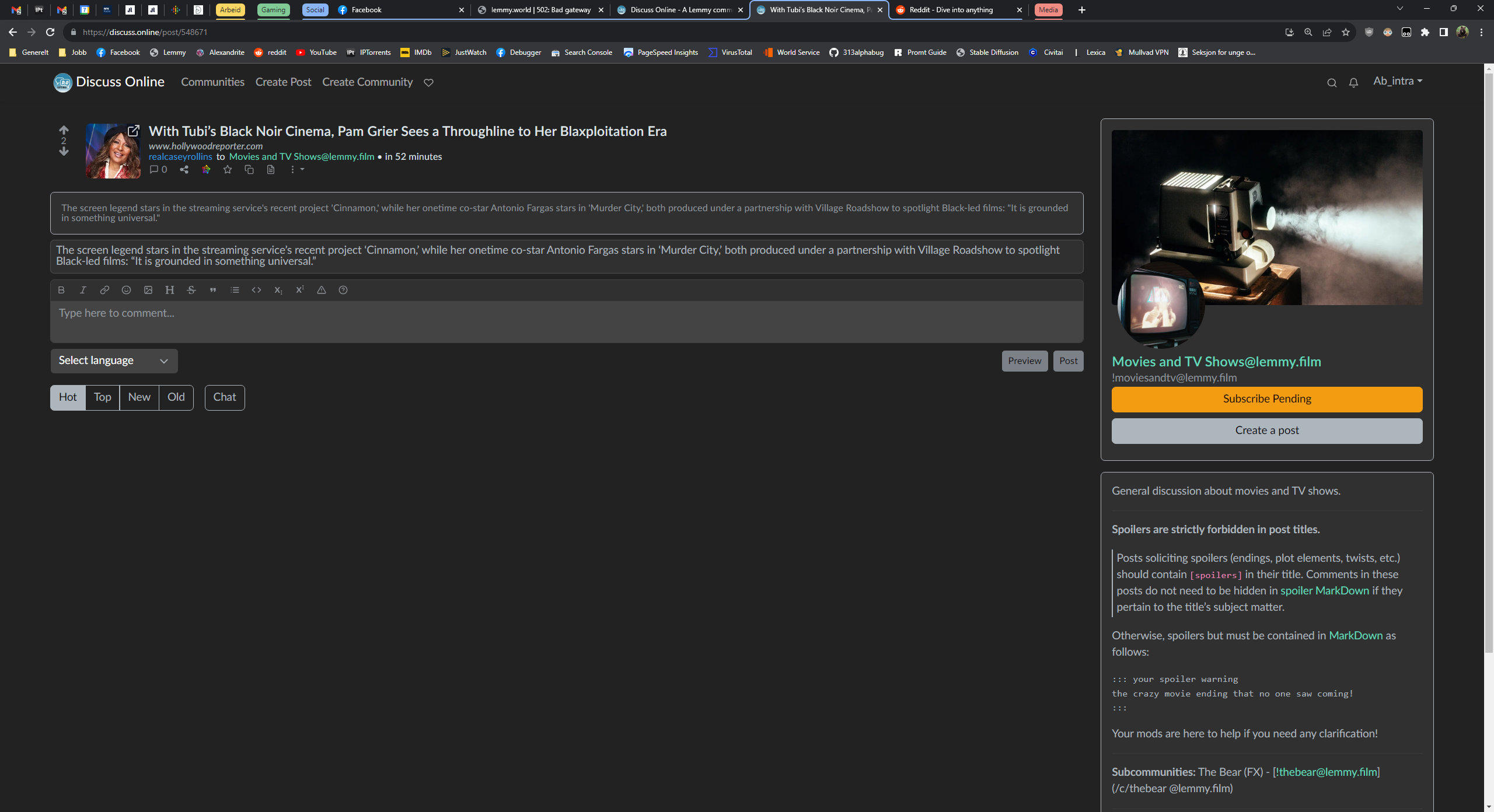
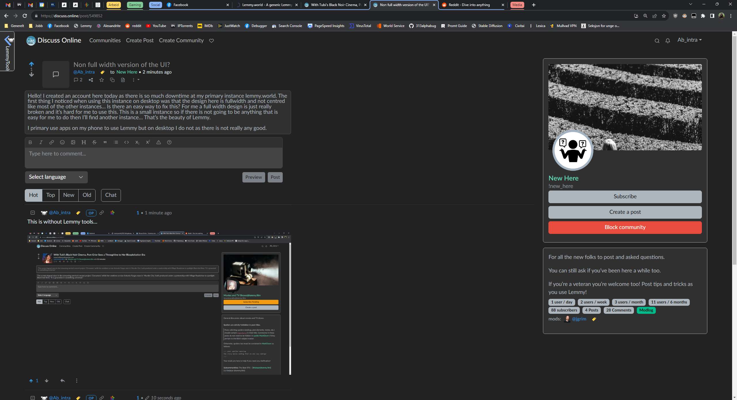
Hello! I created an account here today as there is so much downtime at my primary instance lemmy.world. The first thing I noticed when using this instance on desktop was that the design here is fullwidth and not centred like most of the other instances… Is there an easy way to fix this? For me a full width design is just really broken and it’s hard for me to use this.
I primary use apps on my phone to use Lemmy but on desktop I do not as there is not really any good.
Go to settings, select “Browser Default Compact” theme.
Thanks, I must really be blind… But why is this setting not default…
Well, some of us like full width. 😀
There are two defaults. “Browser Default”, and “Browser Default Compact”, I think most sites use “Compact” one as default. Discuss.online uses “Default” as “Default”.
This is without Lemmy tools…

deleted by creator
Hey thanks for speaking up about this and yes that was not my intention. I’ve removed that sentence completely as it’s not even relevant to the topic. It’s a great way to reach out about this tho! Someone might wanted to make it into a fight.
Don’t know what you are talking about. 😉
This is with Lemmy Tools… It’s a bit better… But no, it just don’t work.


